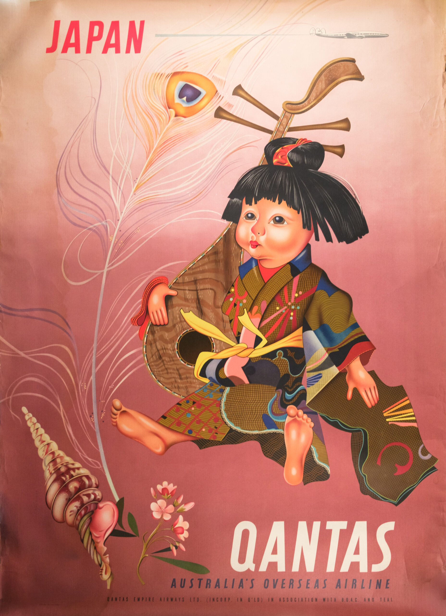
A striking mid-century travel poster promoting Japan as a Qantas destination, produced during the airline’s formative post-war expansion period. Printed for Qantas Empire Airways Ltd., and bearing the partnership line “in association with B.O.A.C. and T.E.A.L.”, a credit format used exclusively between 1954 and 1960, firmly dating this example to that period.
The artwork—attributed to celebrated Qantas designer Harry Rogers—features a vividly stylised Japanese child figure in traditional dress, rendered in the bright, decorative and slightly whimsical style characteristic of Rogers’ mid-century commercial illustration. The composition is set against a rose-toned gradient, with fine decorative elements including a delicate peacock feather and conch shell, symbolising exotic travel motifs typical of Qantas advertising of the era. At the top, a streamlined aircraft silhouette alludes to the airline’s modern international fleet.
This poster formed part of Qantas’ major push to promote new routes throughout Asia, reflecting both Australia’s emerging post-war outward-facing identity and the wider global boom in leisure travel. Original examples of this Japan design are scarce, particularly in good condition, and are highly sought after among collectors of aviation, Australian design, and mid-century travel ephemera.
A vibrant and iconic Qantas destination poster from the golden age of airline advertising.
Additional information
| Weight | 2000 g |
|---|---|
| Dimensions | 101 × 2 × 73 cm |
| Author | Artist: Harry Rogers (attributed) |
|---|---|
| Publisher | Qantas Empire Airways Ltd., in association with BOAC and TEAL |
| Published On | c.1954–1960 |
| Pages | 1 |
| Language | English |
| Dimension | 101cm x 73cm |
| Item Weight | 2kg |